Visualizing Emancipation Project Launches
Map of the Slave Population of the Southern States
Image courtesy of University of Richmond / Library of Congress
Map of the Slave Population of the Southern States
Image courtesy of University of Richmond / Library of Congress
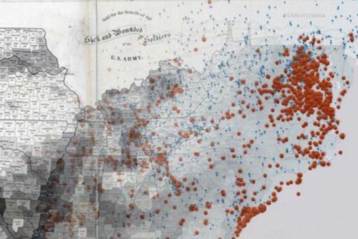
The University of Richmond’s Digital Scholarship Lab recently launched “Visualizing Emancipation," a remarkable mapping project about the end of slavery across the American South during the Civil War. The interactive map plots the shifting legal boundaries of slavery and the locations of United States army regiments alongside thousands of documented actions by enslaved men and women to represent the complicated routes African Americans found to freedom. The project relies on military correspondence, newspapers, and letters and diaries to map the efforts of enslaved men and women. Students, genealogists, and the general public have begun to contribute their own research through the project’s crowdsourcing interface to help tell the story of the end of slavery in the United States.

Slave population of the southern United States, viewed from an angle.
University of Richmond / Library of Congress
Slave population of the southern United States, viewed from an angle.
University of Richmond / Library of Congress
The project is directed by Scott Nesbit and Edward L. Ayers and was funded through a Digital Humanities Start-Up Grant (HD-51083-10). Last week, I was at the NITLE Summit and had the pleasure of attending a keynote speech by Ed Ayers. I have to say, the audience was extremely impressed by the Visualizing Emancipation project both as a research and teaching tool.
Do check out the project website, as well as their press release. Congratulations to Scott, Ed, and the Digital Scholarship Lab.